

Our First Data Analytics Portfolio Project


You don't want to miss out on this believe me, just sit still!! Having done the 6 weeks internship training by Side Hustle Nigeria, we were kept on our toes, looking forward to kickstarting the next journey. Now, here is the thing...
There was a whole lot of stirred emotions when the tech Portfolio teams were assigned. Of course, we had some of us angry, sad, tensed and of course the happy ones. Yeah, we won at last!! The 10 of us found ourselves in the First Data Analytics Portfolio Team.
Now, here comes our greatest tension. We were saddled with our first task which included; Data sourcing, Data Scraping, Data Cleaning and Data Visualization. We're hustlers and yes, we moved to the streets of google, roaming different websites, what are we looking for? A DATASET WITH DETAILS OF PRODUCT(s) used my Nigerians. But guess what? This was a total case of "E CHOKE" because at that time, we found nothing.
Several hours spent online, maybe sweating while tensed, yet nothing but like we'll always say; WE ARE WINNERS! Finally, we caught a glimpse of the Nigeria E-Commerce dataset between February-May, 2021 on kaggle.com/datasets/babajidedairo/nigerian-... Perhaps, E-Commerce is generally used by Nigerians via Jumia, Konga, etc.
Let's see what we did to this dataset one after the other. You might want to grab your pop-corn at this stage.
DATA SCRAPING
With the link to the Kaggle website provided, the raw data-set used for analysis was downloaded as a ZIP file, then, loaded into the Microsoft Excel for cleansing.
DATA CLEANING
STEP1: Thorough checking of duplicate columns was carried out using conditional formatting. The irrelevant column for the analysis was deleted. i.e, the column for "DELETED" which has no story to tell about the data.
STEP 2: Checked for formatted cells. However, the fill colour for one of the columns containing "ITEM STATUS" was removed.
STEP 3: A new column was created, so as to extract the values for actual sales from the "ITEM STATUS" using the "IF function".
DATA ANALYSIS
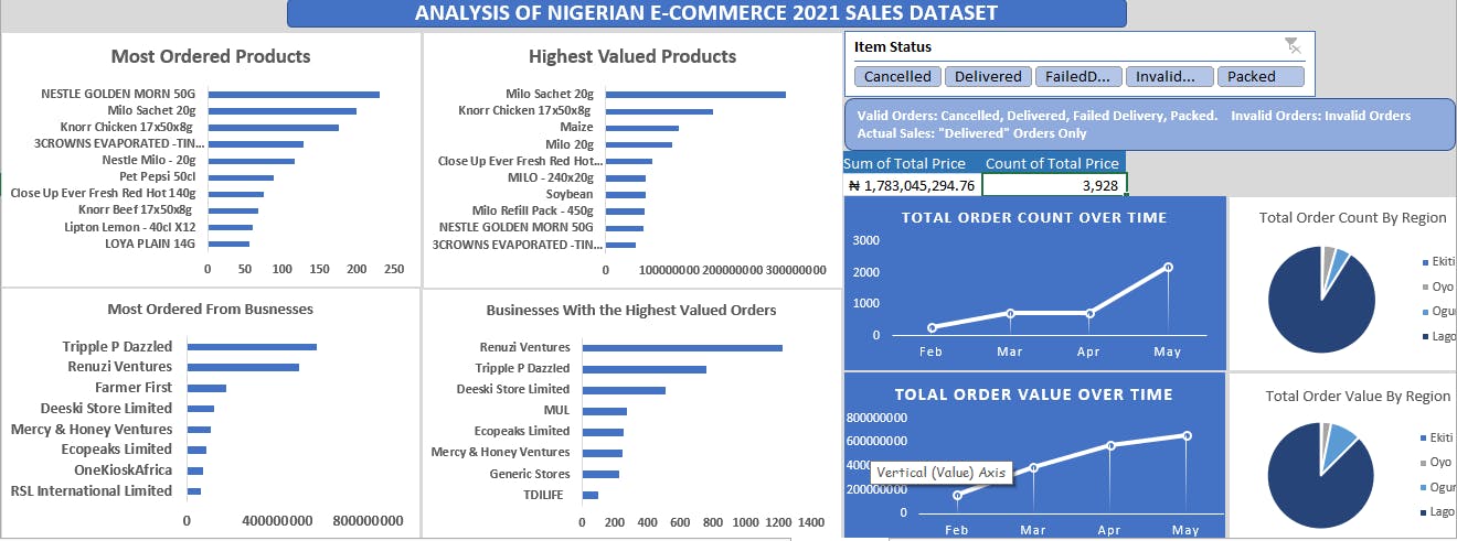
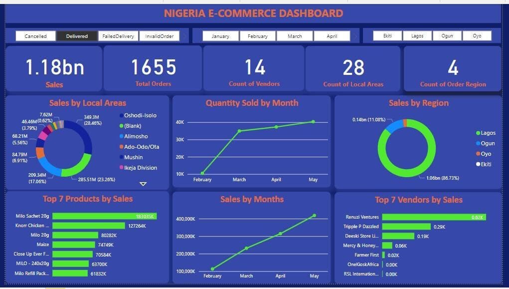
On the MS-Excel, the actual sales and total sales of items made across time (days and months), branch locations, as well as the regions and local areas were analyzed using the "SUM" and "COUNT" function. The total price of the items, total quantity, order status, count of order regions and local areas were studied and analyzed too. Importation of the analyzed data-set from Excel was carried out in the MS-PBi - here, data transformation took place. The necessary power query steps were applied and loaded for visualization. Let me take you back to Excel for a minute, get your bottle water. Pivot tables were created on Excel so as to enable us analyze the data easily and efficiently. You might want to do this on your own, yeah go on, it's worth a try.
DASHBOARDING/CHARTING
The Analytical type of dashboard was used to provide more details to the analysis, hence, investigating the trends and discovering the sales insights. We created excelled dashboards on the MS-Exel and MS-PBi respectively. Line charts were selected to capture the time/trends, as well as the pie chart and the bar/column charts which were used to show the shares from the regions and the category rankings respectively. Relevant Key Performance Indicators (KPIs) as well as slicers were provided to create more insights on the dashboards. How do I forget those colors? Yes, we made magic with our color codes! You heard that right.
Okay, let me not give you a long night. Just relax and watch out for this space!!
Link to excel and power BI files: drive.google.com/drive/u/0/folders/1BMxe9Cn..